AI-aided empathy in the workspace
Redesigning the Manager's Experience


Client: Kaizenfox
Contribution: User Experience and Interface design
Year: 2024
Duration: 1.5 months
Nature: Freelance
Sector: AI-powered Talent Management
Processes: Interface design, Product Strategy, Prototyping, User Flows
Working as an Information Designer with Kaizenfox, offered me a leeway to step into Interface design for perhaps the first time. My role in the organization started by creating audience-appropriate pitch decks to a year later when I was focusing more on user-appropriate interfaces.
I’m excited to share a glimpse of my journey in redesigning the OKR framework interface to improve the manager's experience. This case study explores the reasoning and decision-making process behind the redesign, guided by insights from competitive research and real-time user feedback.
Disclaimer:
While I have worked on multiple structures under this organization, for this case study I would only be focusing on the goal setting and aligning workflows.
The project took place in multiple short segments over a period of one month.
The scope for research in this project was on the lower end, relying on agile feedback loops from stakeholders and users alike.
THE PROBLEM
Employee Engagement Is At An 11-Year Low
% Engaged
% Actively Dis-Engaged
40
30
17
2000
2002
2004
2006
2008
2010
2012
2014
2016
2018
2020
2022
2024
35
30
25
20
15
10
5
0
*Data from GALLUP, Jan 2025
Employee engagement has dropped to its lowest level in 11 years.
In Q1 2024, only 30% of the workforce was engaged, with 17% being actively disengaged.

Key Moments That Drive Attrition
1
Lack of Meaningful Work
Poor onboarding, unclear OKR alignment, destructive team dynamics, and lack of impact visibility hinder effectiveness.
2
Low Wellbeing & Morale
Ignoring employee feedback, inadequate support systems, burnout, and lack of team bonding activities contribute to workplace dissatisfaction.
3
Poor Growth Prospects
Infrequent performance reviews, unclear growth plans, lack of mentorship, and limited learning opportunities hinder professional development.
3
Infrequent Recognition
The absence of a rewards and recognition system, including performance-based rewards, peer recognition, and public acknowledgments, lowers motivation and morale.
THE ORGANIZATION
Rethinking Talent Management with AI driven solutions
Kaizenfox is an AI-powered platform designed to turn talent management into a growth engine for businesses. By focusing on employee engagement, skill development, and strategic alignment, it ensures well-being and productivity for both employees and employers. Kaizenfox gets that human well-being is often undervalued, but focusing on it at a personal level can make a big difference—not just for employees, but for the company’s success too.

Relationships with management are a critical factor in Employees’ life Satisfaction:

THE BRIEF
Redesign OKR Tracking on the platform for effortless adoption and increased efficiency.
The motive given to me was to make the process of OKR tracking as simple as possible. My goal was to avoid clunky dashboards or confusing setups to provide the user with an intuitive experience that fits into their workflow without it feeling like another tedious task. The primary focus was to show just what is required for each stage in the task.
USERS
The onus is on the manager
Managers have a crucial role in creating environments that support good management and healthy relationships—not just for shareholders, but as a moral responsibility—because while many challenges exist in the world, the way bosses treat their teams is one area organizations can truly influence.
Managers shape two key factors:
Good work organization
Clear guidance, tools, and autonomy for meaningful work.
Psychological safety
Where employees feel free from fear. With burnout and stress on the rise, supporting emotional well-being is more important than ever.
PROBLEM SPACE
But what happens to the manager's compromised well-being?
Managing people takes up so much of a manager's time today that it often leaves them drained and stressed, with little time to focus on themselves. Constantly juggling team dynamics and individual needs can quickly lead to burnout and make it hard to maintain a healthy work-life balance.
45% managers are spending more time managing people.*
McKinsey Report, 2021*
67% of managers grapple with heavy workloads, intensifying burnout within the workplace.*
An article on Enterpreneur.com*
Atleast 40% to over 50% of managers report experiencing burnout, underscoring a growing concern in managerial health.*
A webMD report*
PAIN POINTS
Where are managers struggling most with Talent Management?
After speaking with 20 managers at different levels about their struggles with people management, I identified key problems based on common challenges they shared.


COMPETITOR STUDY
Learning from others


I started by really digging into what other companies were doing - looking at both what was working well for them and where they were missing the mark. Studying these other platforms was super helpful because it gave me a solid grasp of what's out there.

What is the manager's primary goal on each screen? and how do platforms approach it differently?

PROBLEM STATEMENT
How might we simplify OKR tracking for managers to reduce mental effort and save time, allowing them to focus on strategy and well-being?
REDESIGN GOALS
How can we make this process easier?
Glanceability
Making sure the design only has it's core functionalities at a glance, without overwhelming the user too much.
Triaging
Easy to navigate with visual hierarchy guiding steps to taking action.
Sense of Control
Design with customizable settings that allow managers to tailor their experience, ensuring communication tools and workstyles are adaptable for everyone.
Understandable
Use clean, simplified visualizations key data, and guide users to actionable insights without overwhelming them with numbers.
ITERATING
How did the design evolve?
The heart of the project was the design of the default ‘card,’ which played a big role in shaping the overall experience. What went on the card kept evolving—it started with details at an individual level and later shifted to goal-based cards. Along the way, we kept refining it through multiple iterations, guided by feedback from stakeholders and users.


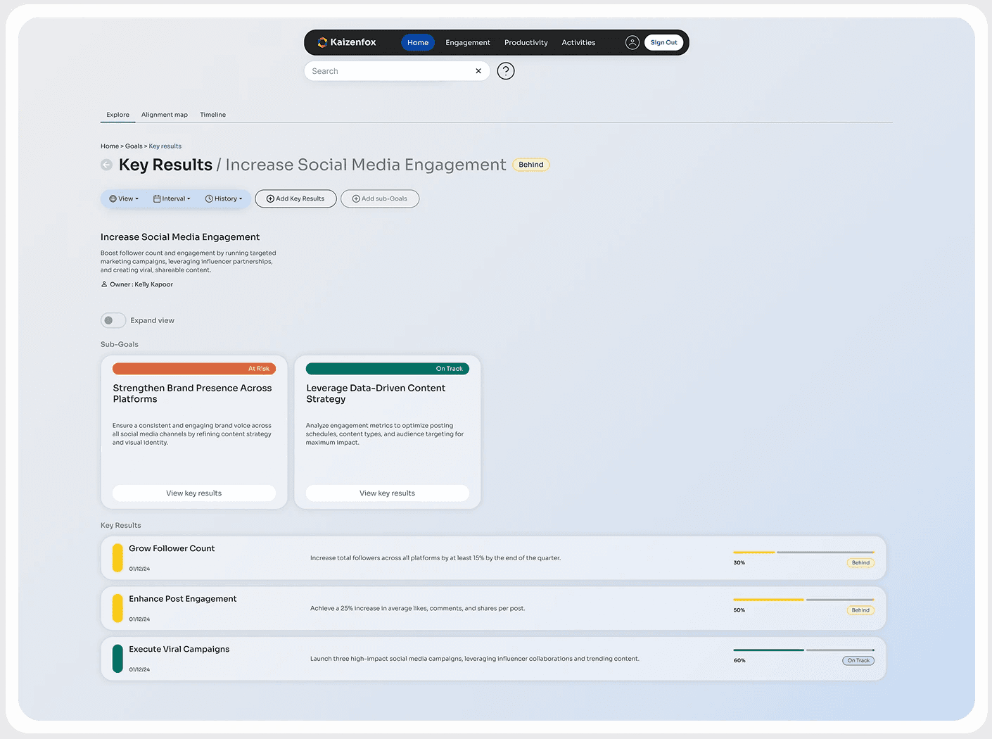
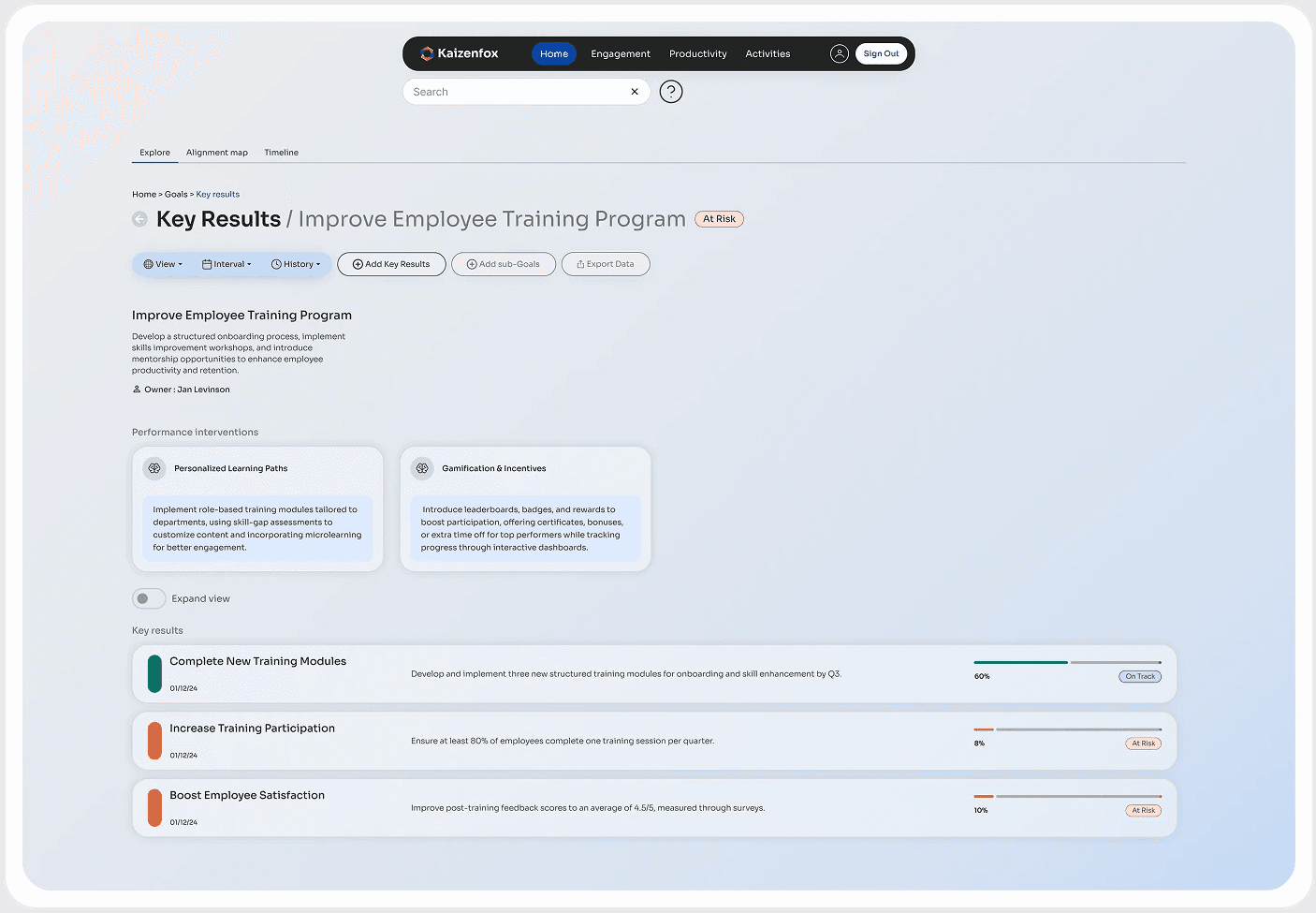
REDESIGN
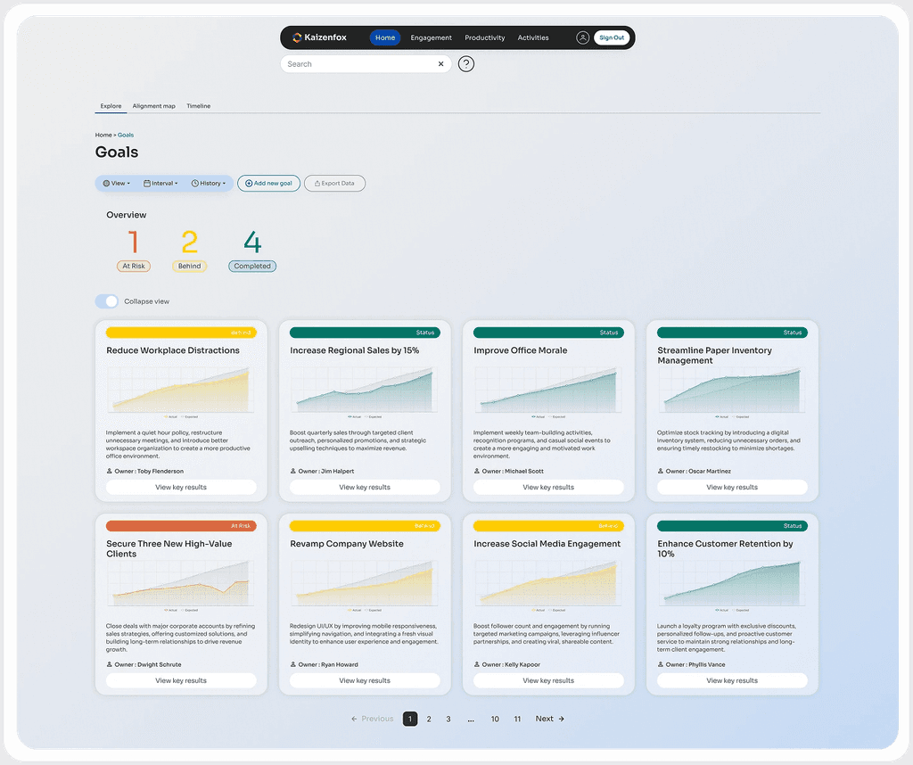
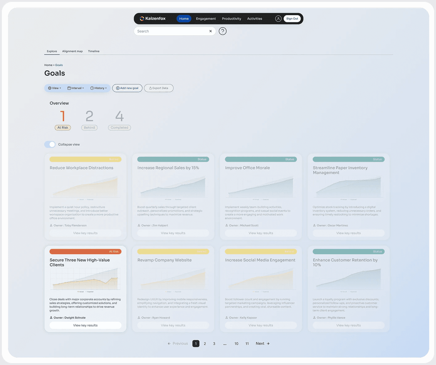
Final screens for Kaizenfox OKR's
1
All your Goals at a Glance
I designed this screen to give a quick snapshot of how things are going in the organization.
Using bold color-coding for goal cards made perfect sense—it keeps things clear and easy to scan without overwhelming with details.
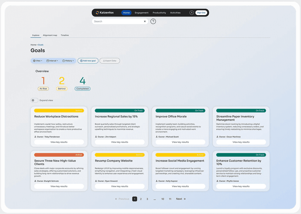
2
Know more, only if you need to
I kept simplicity at the core but ensured people could access more details when needed.
This is especially useful for tracking complex company goals at critical times without overwhelming users upfront.

3
Visually filter things that need intervention
I found that sometimes it’s most useful to focus only on what’s going wrong.
This function filters goals to highlight critical issues while keeping others in the background to show the level of intervention needed.
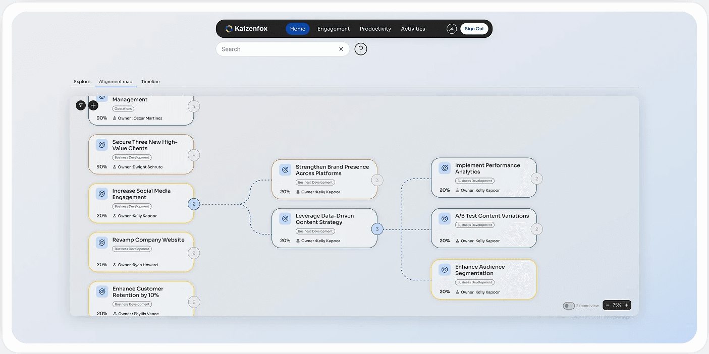
4
Understand the bigger picture - Identify clear roadblocks
I designed the alignment goals page to show a simplified view of how goals relate to each other.
Details for each goal were minimized, and the color coding was toned down. This keeps the focus on relationships rather than goal health or progress tracking.
5
Quick summary of details when you need it
The details page provides a clearer, more in-depth view of goals.
I maintained a consistent design while separating goal and key result cards for better clarity.
Goal health offers a quick action cue, while progress bars for key results help speed up intervention and resolution.
6
Intervene where you need to
This is how a typical goal detail page looks when a goal is at high risk, featuring AI-driven intervention suggestions.
The challenge was designing a distinct card variant for insights—unlike goal or key result cards—while still maintaining consistency in the platform’s design language.
7
Differentiating different 'current state' bars on the same page
A fun micro-challenge was figuring out how to differentiate the various current state bars.
I tackled this by organizing them based on required prominence.
I prioritized states that weren’t obvious to new users and those that needed to be seen first.

SUMMARY
What this culminated to
Behind the scenes, the process involved refining micro-details based on real-time feedback. Most design decisions were shaped by the evolving needs of users and stakeholders, but I also had the flexibility to make certain calls that I could justify. That’s the great thing about working in a truly collaborative team that values collective thinking. These were the final screens that went into development.
The screens were well-received, with fewer user-reported issues.
This also led to greater adoption of the product across various organizations.
LEARNINGS
This journey unfolded lessons I didn’t know I needed
Understanding how designing for an enterprise works
Validate every small decision for feasibility.
Empathy not only for the users but also for every other team member involved in this process.
Enterprise software is still built for people—we often forget that.
Humans are engineered to gravitate around the concept of play, keep things fun.
Lessons for my design process
Use Common sense.
Figma auto-layout is your best friend.
Organizing your file is an investment you make in saving time.
Leverage what people are used to, intervene where people find struggle.
Give equal importance to white space as you would with content.
Under different circumstances,
While it was one of the most profound learning experiences I have benefited from it came with its own limitations of time and resources. If I could do it differently, I would dedicate a lot of time to research and analysis. Talking to users is what I did to guide my design but given another chance I would make sure I get access to an unbiased set of users and push for some more testing so I know that my design decisions are duly validated.
Back to top