
Framing Inequalities

A tangible data visualization comparing national income disparity within countries.
Objective: To understand and explore tangibility of data visualisation with the aid of physical space and materials.
Year: 2024
Duration: 2 weeks
Nature: Academic
Limitations: All data explorations were bounded by data encircling the UN Sustainable Development Goals.
I did this project as a part of a Tangible Data Visualization course offered as a part of my post-graduate program. The primary goal was to explore data visualization beyond the traditional scope of paper and screen. Challenging at first, it slowly taught me to look at sensory and spatial dimensions of data critically along with it's ability to be seen.
How can data be felt ?
Can you hold data?
Can data be inhabited?
This meant engaging with materiality, context, physical interaction and a generous amount of trial and error!
The 17 UNSDG goals
Understanding the boundary


As a (very necessary) limitation to this project, we were asked to bind ourselves within the United Nations Sustainable Development Goals or the UNSDGs. A little bit about these:
The United Nations Sustainable Development Goals (UNSDGs) are a set of 17 global objectives established in 2015 as part of the 2030 Agenda for Sustainable Development, aiming to address a broad spectrum of challenges including poverty, inequality, climate change, environmental degradation, and peace.
Naturally, I skimmed through all information I could find about these goals. I started to understand where these goals are coming from, why they are important and the interconnectedness within them. This would then lead to me understanding:
1. What is the story I am trying to tell?
2. What is the data I can use to narrate this story?
data sources
Exploring the available datasets


To explore SDG datasets I looked into reliable platforms like the UN SDG Global Database or the World Bank SDG Databank, where comprehensive indicators for each goal are available. At this stage,
I reviewed the datasets to identify trends, gaps, and areas that are most relevant to my research interests, such as poverty, inequality, and climate action.
During this process, I'd critically assess the limitations of standardized metrics, like the international poverty line, to understand how well these indicators reflect the complexity of real-world challenges.
decision making
Choosing the goal and understanding the dataset
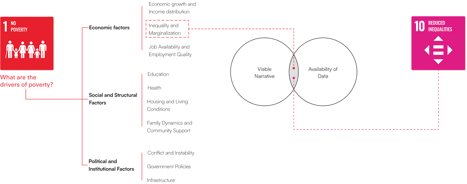
Initially, I chose SDG Goal 1 (No Poverty) due to the central role it kept playing in relation to development indices worldwide. Along with that, it was also convenient due to abundance of data, particularly related to income levels and poverty thresholds. However, as I delved deeper, I recognized the limitations of focusing purely on income and poverty lines whose accuracy has become to source of prominent economic debates around the world.
This led me to pivot to Goal 10 (Reduced Inequality), where I found a more nuanced perspective on economic disparities. I ultimately decided to focus on the Palma ratio, a measure that highlights inequality by comparing the income share of the richest 10% to that of the poorest 40%, offering a clearer and more focused representation of inequality.
ideation
Wading through possibilities
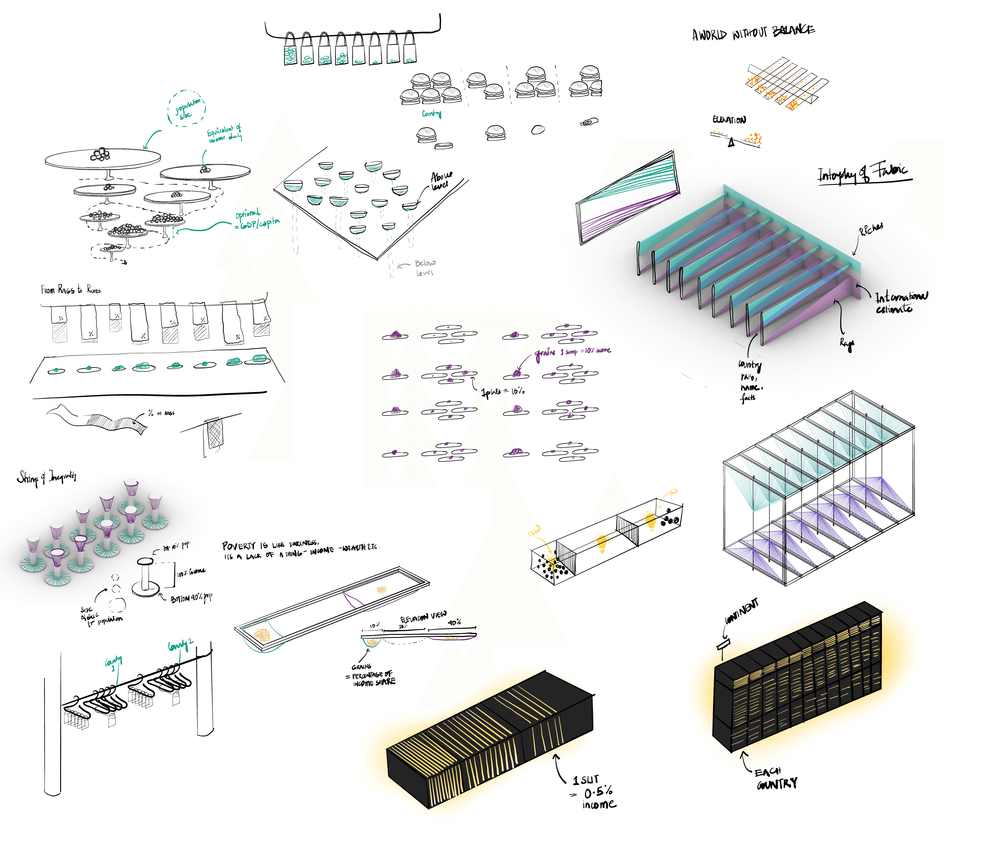
When I believed that the data was more or less ready to be visualized, I went straight into ideating. The ideating phase involved- looking at inspiration, working with available resources, understanding limitations of time and a lot of back and forth feedback.
Although ideal, there was very little scope for prototyping due to the kind of timeline I was working with.
production
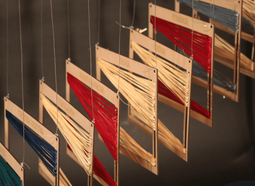
Giving it life
Playing with materiality and unpredictability was unexpectedly a challenge. From planning spatial arrangement to sourcing materials an putting it all together, was nothing short of a roller coaster.

final product
Assemblage
The final product put out to the world to critique!


Back to top